About this component
TheForm component is a super versatile tool that can fit right into your product UI or pop up in a modal for things like surveys. They can be used for wide range of use cases including registration flows, surveys, feedback forms, and more. The component supports form validation (client and server-side), conditional fields, branching logic, and multi-step Flows.
When to Use Forms:
- Embedded in UI: Forms work great for tasks like product registration, helping users get started smoothly without leaving the page.
- Modal Surveys: Use forms in modals for surveys or feedback, making it easy for users to share their thoughts without disrupting their experience.
- Conditional and Branching Logic: Forms can adapt based on user responses, guiding them through a tailored experience that feels intuitive.
- Custom React Steps: You can embed custom React components to invite teammates or perform API lookups, adding a personal touch to your forms.
- Customizable Input Types: With a variety of built-in input types—like text fields, multiple-choice options, and dropdowns—you can design forms that suit your specific needs.
- Provide Progress Indicators: Adding progress bars or step indicators (like “Step X of Y”) can help users see how far they’ve come and what’s left to do. This makes the process feel less daunting and more manageable.
- Streamlined Data Collection: Frigade makes it easy to create new forms quickly, allowing you to gather user data and send it wherever you need it in your system.
Resources
- Create a form and send events to Slack
- Launch pop-up forms and surveys with no-code using Collections
- Target your form to specific users with Targeting
- See industry examples of forms
Demo
- See forms in action in our live demo
Customization
To learn about how to customize Frigade components, see the customization documentation and examples of custom themes in action.Examples
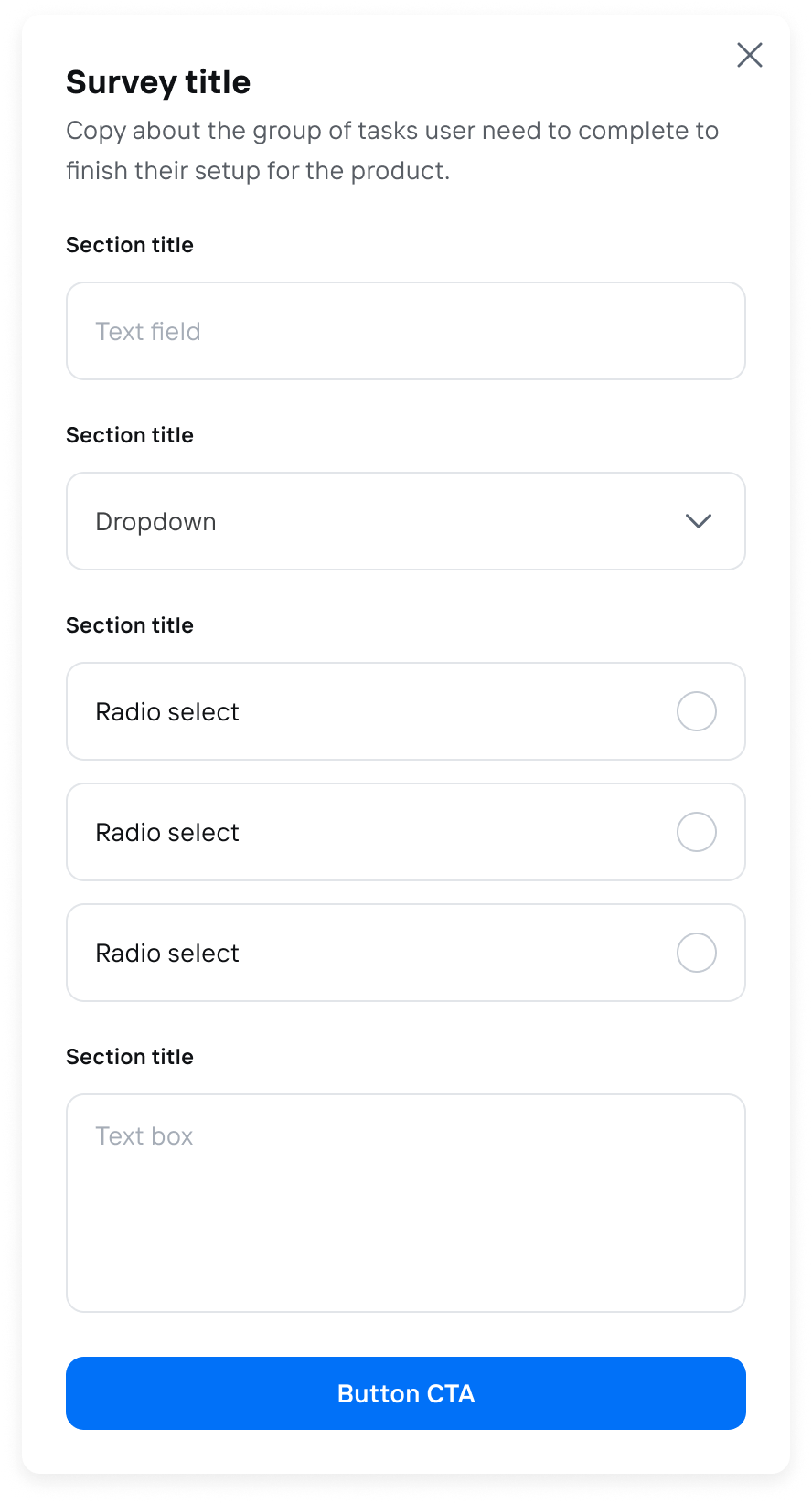
The following section includes ready-made examples and code for various form use cases.Simple Modal Form
- Component
- Configuration and Code
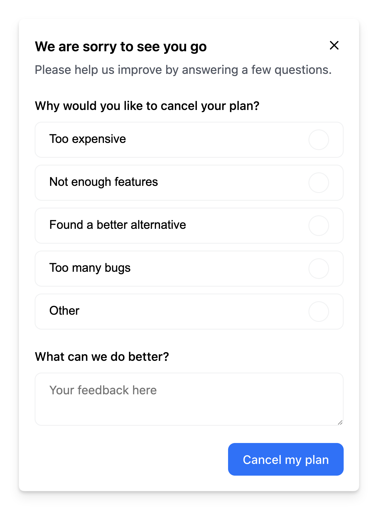
Churn Survey
- Component
- Configuration and Code
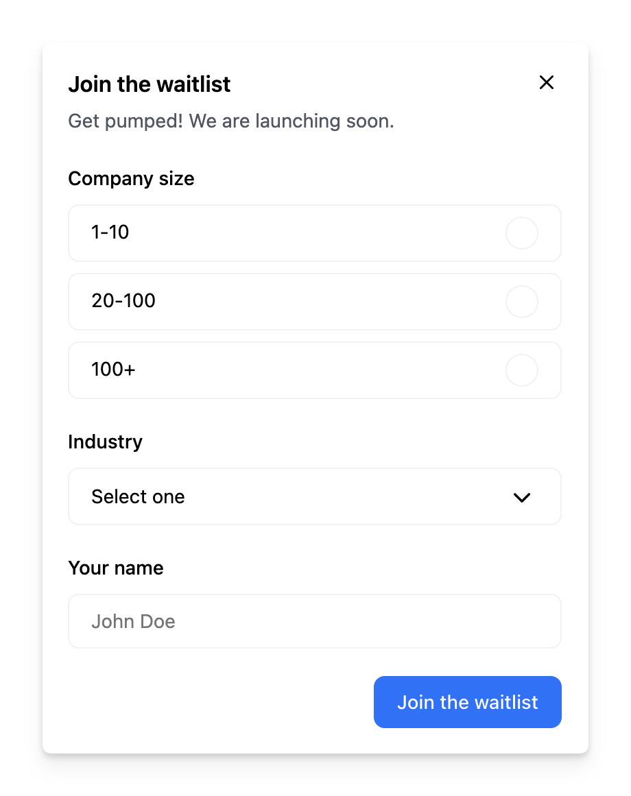
Dynamic Fields
- Component
- Configuration and Code
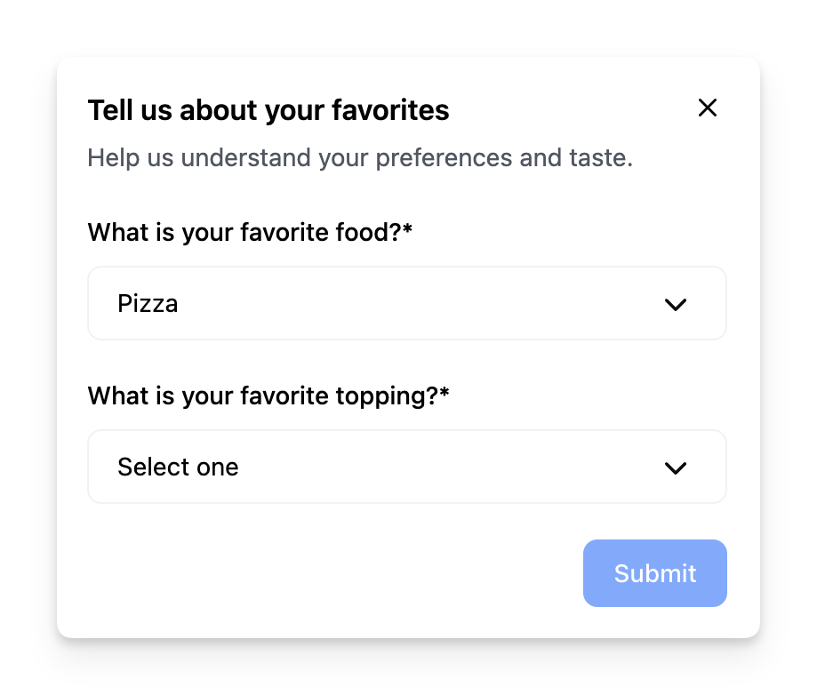
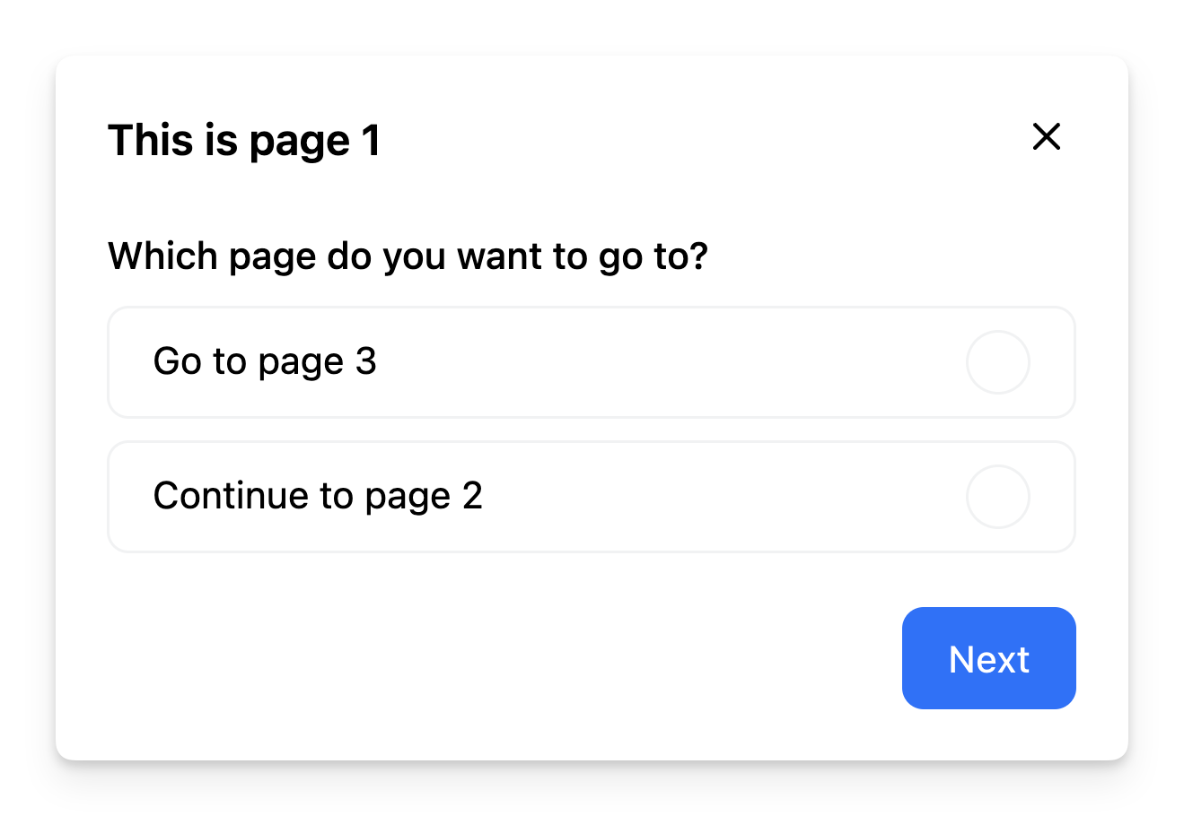
Branching Forms
- Component
- Configuration and Code
Supported Field Types
The component supports the following builtin field types that correspond to their respective HTML input types:-
select -
radio -
text -
textarea -
checkbox
Overriding Field Attributes
You can override or add any attribute for a field by using theprops property in the field configuration.
For instance, this is useful if you want to use the text field type, but override the type to email or tel. It can also be used to add any attribute such as a css class, data, or styling.
Custom Field Types
The Form SDK is built on top of react-hook-form, which means you can use the majority of its features in your forms. You can define your own custom field types using thefieldTypes prop.
For instance, you can implement a simple calendar datepicker field type as such:
company-size to show up when a user selects company in the customer-type field:
Form Validation
The component supports client-side and server-side validation out of the box. You can define validation rules for each field in the form configuration using thepattern property with a regular expression. The example below shows how to validate an email field:
Server-side Validation
You can perform server-side validation by returning a Promise from theonPrimary event handler. If the promise resolves to false, the current step in the form will not be marked as completed. The onPrimary event handler also contains all form data collected in the session, which allows you to send the data to your server for validation or storage.
Browser Navigation
You can implement browser navigation (back/forward) with your Frigade forms using the useFlow hook. This allows users to navigate through form steps using their browser’s back and forward buttons. Here’s an example of how to implement this:- Uses the
useFlowhook to get access to the flow instance - Uses a ref to store the flow instance and prevent re-renders
- Sets up an event listener for browser navigation (
popstate) - Handles browser back/forward navigation by moving to the appropriate step using
flow.back()orflow.forward() - Cleans up the event listener when the component unmounts
Prefilling a form
Forms can be prefilled by using Dynamic Variables by linking thevalue of a field to the variables prop of the Form component. The example below shows how to prefill a form with the user’s name:
Customization
To learn about how to customize Frigade components, see the customization documentation and examples of custom themes in action.SDK Properties
- React Props
- Flow Configuration (Advanced Editor)
Optional component to wrap the child components in, e.g.
as={Dialog} will render the Flow in a modal Dialog. Defaults to Box.Whether to automatically mark the Flow started (i.e. in progress) when the Flow is eligible to be shown.
You will need to call
flow.start() or step.start() from the parent component if you set this to false. Most components should not need to override this behavior.Defaults to true.Emotion CSS prop to apply to the component. See Theming documentation for more information.Example usage:
Whether the Flow is dismissible or not
Custom field types to be used in the Form.
You can use this to build your own custom form fields in a
Form.For example, if you want to use a custom field type called calendar:The Flow ID to render. You can find the Flow ID in the Frigade dashboard.
If true, the Flow will be mounted even if it has already been completed or dismissed.
However, if the user does not match the Flow’s targeting, the Flow will not be mounted.
Register the Flow as a modal to prevent popup collisions (only one modal Flow will render at a time).
Handler for when the Flow is completed. This is event is fired immediately after the user completes the Flow.
Handler for when the Flow is dismissed (skipped). This is event is fired immediately after the user dismisses the Flow.
Handler for when primary button is clicked.
If this function returns false or a promise that resolves to
false, the step will not be automatically completed when clicked.Handler for when secondary button is clicked.
If this function returns false or a promise that resolves to
false, the step will not be automatically completed when clicked.Variables to pass to the Flow. You can use variables in the Flow configuration to customize copy.
For instance, you can use
title: Hello, ${name}! in the Flow configuration and pass variables={{name: 'John'}} to customize the copy.