About this component
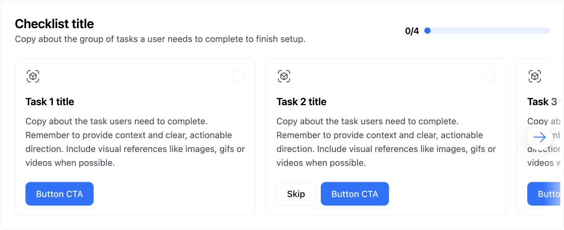
TheChecklist component is one of Frigade’s most popular tools, especially for user onboarding and activation. They’re super handy for guiding users through their journey, whether it’s at the start of their experience or when they’re setting up a new product vertical or a complex feature.
When to Use Checklists:
- Onboarding and Activation: Checklists are perfect for helping users get started and ensuring they complete essential tasks. They provide a clear path forward and help users feel more confident as they navigate your product.
- Two Default Versions: Frigade offers two out-of-the-box checklist formats—carousel and collapsible—so you can choose what fits best for your users. Plus, if you need something custom, you can easily build one using the Frigade SDK/API.
- Deeply integrated: The most effective checklists measure actual in-product results. Frigade makes it easy to connect checklist steps to automatically complete from actual in-product actions and milestones.
- Limit the Number of Tasks: Keep your checklists manageable. Too many tasks can overwhelm users, so aim for a concise list that’s easy to follow.
- Pre-Complete Steps Where Applicable: For example, marking “Set up account” complete after sign up can show users progress from the start and create a sense of momentum (like showing 20% done instead of 0%).
- Avoid Basic “Mark Done” Steps: Whenever possible, tie checklist steps to actual workflows and tasks. Deep linking users to complete actions is way more effective. It’s okay to have “Skip” or “Mark done” as secondary options for non-essential steps.
- Include a CTA to Hide the Checklist: Giving users the option to hide the checklist can help them feel more in control of their setup and UI.
- Break Large Workflows into Smaller Segments: If you have a hefty checklist (like 12 steps), consider phasing it and breaking it into smaller groups (like two groups of 6). This makes it feel less daunting.
- Measure Completion Rates: Keep track of how users are progressing through each step and the entire checklist. This data can help you identify areas for improvement for future iterations.
Resources
- Target your checklist to specific users with Targeting
- Dynamically mark a step complete
- Create shared checklists using Group Properties and completion criteria
- See industry examples of checklists
Demo
- See checklists in action in our live demo
Installation
- Code
- No-code
Customization
To learn about how to customize Frigade components, see the customization documentation and examples of custom themes in action.SDK Properties
- React Props
- Flow Configuration (Advanced Editor)
Optional component to wrap the child components in, e.g.
as={Dialog} will render the Flow in a modal Dialog. Defaults to Box.Whether to automatically mark the Flow started (i.e. in progress) when the Flow is eligible to be shown.
You will need to call
flow.start() or step.start() from the parent component if you set this to false. Most components should not need to override this behavior.Defaults to true.Emotion CSS prop to apply to the component. See Theming documentation for more information.Example usage:
Whether the Flow is dismissible or not
The Flow ID to render. You can find the Flow ID in the Frigade dashboard.
If true, the Flow will be mounted even if it has already been completed or dismissed.
However, if the user does not match the Flow’s targeting, the Flow will not be mounted.
Register the Flow as a modal to prevent popup collisions (only one modal Flow will render at a time).
Handler for when the Flow is completed. This is event is fired immediately after the user completes the Flow.
Handler for when the Flow is dismissed (skipped). This is event is fired immediately after the user dismisses the Flow.
Handler for when primary button is clicked.
If this function returns false or a promise that resolves to
false, the step will not be automatically completed when clicked.Handler for when secondary button is clicked.
If this function returns false or a promise that resolves to
false, the step will not be automatically completed when clicked.How to sort the default the completed steps of the carousel.
completed-lastwill sort the completed/skips steps to the end of the carousel.defaultwill keep the order of the steps as they are in the flow.
Variables to pass to the Flow. You can use variables in the Flow configuration to customize copy.
For instance, you can use
title: Hello, ${name}! in the Flow configuration and pass variables={{name: 'John'}} to customize the copy.