The useFlow hook sits one layer deeper in the React SDK than the Flow Component and serves as the connection between our vanilla JS data layer and React Components.

In most cases, you’ll want to use <Flow> over useFlow, but if you need a deeper level of control over the lifecycle and behavior of a Flow, or if you need access to a Flow outside of a Component, this hook is for you.

In this example, we’ll build a Progress Badge using the useFlow hook for the data layer. Additionally, we’ll leverage a series of prebuilt Frigade component primitives such as <Box> to build the UI.

The final result looks like this:
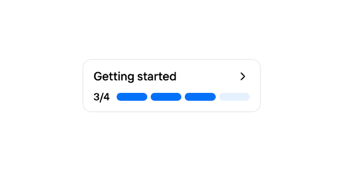
A custom built progress badge

First, create a new Flow in the Frigade Dashboard by navigating to the Flows tab and clicking Create Flow. Select Custom Flow as the Flow type.

You can use any code you wish for the YAML configuration, however, we recommend starting with the following example:

steps:
    # Only the id field is required per step.
  - id: unique-step-id-1
    title: Some title
    # You can add any custom fields here.
    # They will automatically be available in the Flow object.
    foo: bar
  - id: unique-step-id-2
    title: Some title
  - id: unique-step-id-3
    title: Some title

We’re now ready to wire in the frontend code. Start by simply importing the useFlow hook. We’ll then use the hook to get the flow data and calculate the number of steps completed and the total number of steps:

import { useFlow } from '@frigade/react';

export function ProgressBadge() {
  const flowId = 'flow_RgilNasCrSBQmrVM'; // Replace this with the Flow ID found in the Frigade dashboard
  const { flow } = useFlow(flowId);
  const stepsCompleted = flow?.getNumberOfCompletedSteps();
  const totalSteps = flow?.getNumberOfAvailableSteps();
}

To see the full list of methods and fields in the flow object, see the Flow API Reference.

Now, all we have left to do is to build the UI. We’ll use the Box and Text components from the Frigade React SDK to build the UI. We’ll also use the IconRender component to render the ChevronRight icon from the lucide-react package:

import { Box, Text, useFlow } from '@frigade/react';
import { ChevronRight } from 'lucide-react';

export function ProgressBadge() {
  const flowId = 'flow_RgilNasCrSBQmrVM';
  const { flow } = useFlow(flowId);
  const stepsCompleted = flow?.getNumberOfCompletedSteps();
  const totalSteps = flow?.getNumberOfAvailableSteps();


  if (!flow) {
  return null;
  }

  // This flag is automatically set to false if the Flow is not visible to the user.
  // Flows will automatically be hidden if the user has already
  // finished the Flow or if they don't fit the audience.
  if (!flow.isVisible) {
  return null;
  }

  return (
      <Box
        display="flex"
        flexDirection="column"
        border="md"
        borderRadius="md"
        borderColor="neutral.border"
        py={2}
        px={3}
        gap={1}
      >
        <Box
          display="flex"
          flexDirection="row"
          justifyContent="space-between"
          alignItems="center"
        >
          <Box display="flex">
            <Text.Body2
              fontWeight="medium"
              color="--fr-colors-x-sub-header-text"
            >
              Getting started
            </Text.Body2>
          </Box>
          <Box display="flex">
            <ChevronRight />
          </Box>
        </Box>

        <Box
          display="flex"
          flexDirection="row"
          justifyContent="center"
          alignItems="center"
          gap={2}
        >
          <Box display="flex" alignItems="center">
            <Text.Caption
              fontWeight="medium"
            >
              {stepsCompleted}/{totalSteps}
            </Text.Caption>
          </Box>
          <Box
            display="flex"
            gap={1}
            justifyContent="space-between"
            alignItems="center"
            width="100%"
          >
            {Array.from({ length: totalSteps }, (_, i) => {
              const stepNumber = i + 1;
              const isCompleted = stepNumber <= stepsCompleted;
              return (
                <Box
                  key={i}
                  backgroundColor={
                    isCompleted
                      ? 'blue'
                      : 'grey'
                  }
                  borderRadius="md"
                  height="9px"
                  width="100%"
                  display="flex"
                />
              );
            })}
          </Box>
        </Box>
      </Box>
  );
}

That’s it! You’ve built a custom component using the Frigade React SDK.